Church website checklist: pages every church needs
Build a church website visitors can use. A page-by-page checklist covering service times, visits, ministries, events, giving, and a private member home.
The short answer
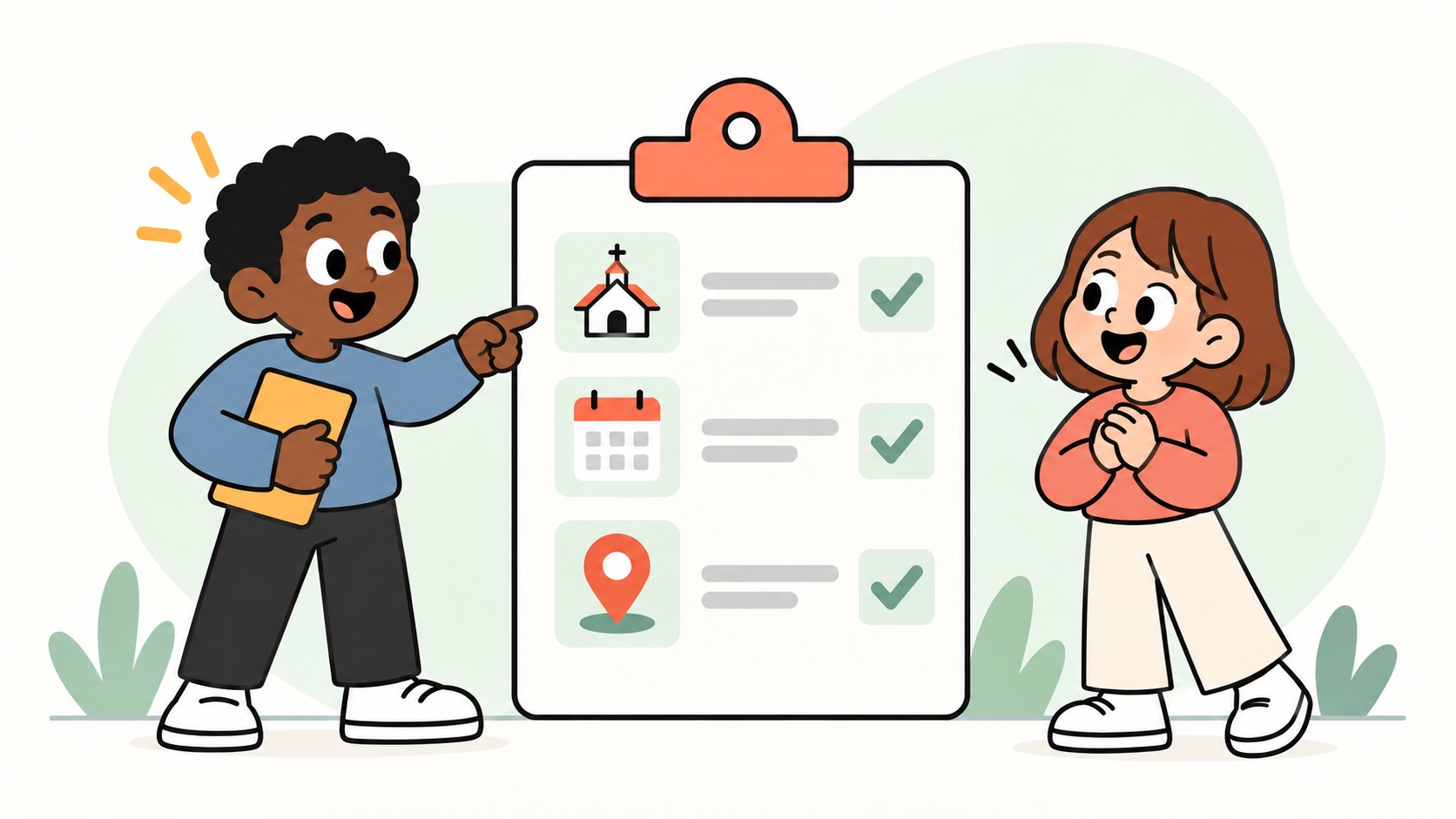
Start a church website with seven pages: Home, Visit, About, Ministries, Events, Give, and Contact. Put service times, the address, and a clear next step where a visitor can find them on a phone. Keep internal announcements and volunteer coordination in a private member home.
- Finish visitor-facing pages before expanding the site.
- Give each page an owner who keeps its information current.
- Separate public invitations from private member coordination.
A small church website has one job for a first-time visitor: answer "Should I show up this Sunday?" before they bounce. Staff and volunteers already know the answers. The site just needs the right pages in the right places.
Use this checklist as a build order. Finish the visitor pages first. Add member-facing tools after the public site can stand on its own.
Start with the pages visitors actually need
Skip the 20-page sitemap. Start with a short public set:
- Home: Who you are, when you meet, and a clear next step (visit, watch online, or contact).
- Visit / Plan your visit: Address, parking, service times, what to expect with kids, and dress vibe in plain words.
- About: Beliefs or values in short form, leadership names with faces, and a short history only if it helps newcomers.
- Ministries / Groups: What runs midweek. Link each group to a contact or interest form.
- Events: Upcoming services, special nights, and community events. Keep past events from crowding the list.
- Give: Link to the giving tool you already use. You do not need to rebuild payments on day one.
- Contact: Phone, email, office hours, and a simple form.
That set covers almost every "new family Googled us" path. If a page does not help a visitor decide whether to come, park it for later.
Home page: say the practical things up top
Your home page should answer time, place, and welcome in the first screen on a phone.
Include:
- Service day and times
- Physical address (and a map link)
- One sentence on who you are
- One primary button: Plan a visit, Watch online, or Contact us
Photos help when they show real people in your building. Stock cathedral shots train visitors to expect a different church than yours.
Visit page: remove friction for first-timers
The visit page is where anxiety lives. Treat it like a host at the door.
Cover:
- Where to park and which door to use
- What happens in the first 10 minutes
- Kids and nursery details (ages, check-in, where parents wait)
- Accessibility notes (elevator, hearing loop, quiet space)
- Who greets newcomers, if you have a team
A short "What we wear / what the room feels like" paragraph beats vague "everyone is welcome" language. Welcome is proven by clear logistics.
About and leadership: keep it human and short
Newcomers scan for faces they might meet. Bios of two to four lines plus a photo are enough. Long doctrinal essays belong on a beliefs page or PDF if your tradition needs them.
If you have multiple campuses or service styles, say so here so people do not drive to the wrong building.
Ministries without a maze
List groups by who they serve (kids, students, adults, care) rather than by internal org chart. Each item needs:
- One-line description
- When it meets
- How to join (form, email, or "ask at the welcome table")
If a ministry is paused, hide it. An outdated list reads like an empty building.
Events: public calendar vs member RSVPs
Public event listings should stay light: title, date, time, location, and who it is for. Detailed headcounts, volunteer shifts, and internal notes belong where members log in.
For a small church, a weekly rhythm plus a handful of special events is enough. If the calendar looks busy but attendance is thin, trim the public list and put operational detail in the member area.
Give and contact: link out without apology
Most churches already have a giving processor and an email inbox that works. Put clear buttons to those tools. The website's job is to make the path obvious, not to replace every system on day one.
Same for livestream embeds: if you already stream elsewhere, link or embed what you use. Do not delay the rest of the site waiting for a perfect media stack.
Pages to add only when you need them
Useful later, not required for launch:
- Sermons / media archive
- Beliefs / statement of faith (full version)
- Staff directory beyond primary leaders
- Care / counseling request form
- Facilities rental info
- Jobs or internship listings
Each of these is fine when someone owns updating it. Orphan pages go stale fast.
Member home: what stays off the public site
Once the public pages work, give regulars a private place for announcements, group posts, messaging, event RSVPs, and shared notes (wiki-style pages for how-tos and schedules). That split keeps the public site calm for visitors and gives members a home that is not a dying group chat.
Use Guava with this in mind: a public website builder plus a private member home, with forms, events/RSVP, profiles, posts, messaging, and wiki pages in one product. Free covers a Guava address for groups up to 50 members. Plus adds your own domain, unlimited members, branding removal, and Mailchimp/Kit when you need those.
Launch checklist you can print
- Home answers time, place, and next step above the fold on mobile
- Visit page covers parking, doors, kids, and first-timer expectations
- About shows real leadership faces
- Ministries list is current and joinable
- Events show only what the public should see
- Give and Contact link to tools you already run
- No draft ministries or dead sermon links in the nav
- Someone is named as the person who updates the site monthly
- Member announcements and RSVPs have a private home (not only a chat thread)
Next step
Build the visitor pages first, then add forms and member tools for the people who already belong. If you want that public site and private home in one place, start on Guava's church website builder.
Useful next steps

Guava Team
We build Guava: a website and private member home for groups that meet in real life.